


 , Gercina Ângela de Lima 1
1 Programa de Pós-Graduação stricto sensu em Gestão & Organização do Conhecimento (PPGGOC), Universidade Federal de Minas Gerais, 31270-901 Belo Horizonte, Minas Gerais, Brazil
Abstract
In the field of Information Science, Knowledge Graphs (KG) have emerged as a prominent approach to Knowledge Organization (KO) and Knowledge Representation (KR), supported by Knowledge Organization Systems (KOS) such as taxonomies and thesauri. KGs provide scalable, ontology-enriched structures for managing large volumes of data. Despite criticisms concerning limited semantic expressiveness and modeling quality, KGs remain essential in big-data contexts, where exploratory analysis and visualization are fundamental to identifying patterns and generating insights. Scientific literature indicates that many visualization approaches are algorithm-centered or tool-oriented, often neglecting user-centered design and cognitive ergonomics. To address these limitations, this study aims to identify and evaluate visualization techniques that support user-centered design, focusing on cognitive and usability needs in exploratory and interactive analysis. The methodological approach is based on Design Science Research (DSR), combining a Systematic Literature Review (SLR) and semi-structured interviews to identify user requirements and inform the design of visualization solutions. As a result, the Deigmata system was developed—a user-centered KG visualization tool that facilitates collaborative analysis across multiple user profiles. The tool integrates interactive process triggers that reduce exploration barriers, particularly for non-expert users.
Keywords
- knowledge graphs
- knowledge organization
- user-centered visualization
- design science research
- Deigmata system
In Library and Information Science (LIS), the concepts of Knowledge Organization (KO) and Knowledge Representation (KR) are closely interrelated (Hjørland, 2008; Lima, 2020). While KO focuses on the structuring of recorded knowledge to facilitate information retrieval, KR, considered a subdomain of KO, deals with the symbolic modeling of human knowledge through Knowledge Organization Systems (KOS). These include conceptual tools such as classification systems, thesauri and taxonomies, which enable the organization, storage and retrieval of information within specific domains of knowledge (Lima and Maculan, 2017; Zeng, 2008).
In this context, Knowledge Graphs (KG) have emerged as a contemporary approach to knowledge organization, offering scalable and dynamic structures to represent information for retrieval and analysis, demonstrated to be a great approach for modern necessities. Since Google adopted the KG model in 2012, its use has expanded across various sectors (Li et al., 2020; Hogan et al., 2021), reinforcing the principle that real-world data should be treated “as things, not strings”. However, critics within the KO field raised concerns, particularly regarding the semantic limitations of some KGs, referred to as “little semantic”, for merely labeling entities rather than capturing their deeper conceptual meanings (Chaudhri et al., 2022) and the poor quality of modeling practices that lead to biased or low-value data.
Despite these criticisms, the integration of ontologies can significantly enhance KGs, making them more semantically robust and flexible. Ontological enrichment allows KGs to scale while preserving conceptual formalism, thereby improving their capacity to represent large and heterogeneous datasets without compromising the data acquisition process. This feature is particularly valuable in big data environments, where the volume and variety of information demand advanced methods for knowledge organization and representation. Big data technologies have indeed increased the possibilities for storage and processing, but have also introduced new challenges for the exploration and interpretation of KG (Chen et al., 2022; Janvrin et al., 2014). Exploratory data analysis has become a key practice in this scenario, enabling iterative discovery that uncovers patterns, outliers and detailed facets aligned with user needs. Visualization plays a central role in this process, offering intuitive and dynamic ways to navigate complex knowledge structures (Kalinsky et al., 2022).
However, the scientific literature emphasizes the proliferation of diverse visualization approaches, driven by the structural and semantic variability across different datasets and their subsets. Despite this expansion, many of these methods are predominantly algorithm-driven or tool-oriented (Deagen et al., 2022), frequently disregarding user-centered principles and cognitive ergonomics—essential for effective data interpretation and exploratory analysis.
Consequently, this study poses the following research question: Which visualization techniques and methods best support user-centered ergonomic enhancements in the exploratory and interactive analysis of KG? Accordingly, the primary objective is to identify and evaluate visualization approaches that effectively enhance user-centered ergonomics in KG exploration, with a particular focus on the cognitive demands and usability requirements of end-users.
For this purpose, the present study adopts a Design Science Research (DSR) methodology, which encompasses a Systematic Literature Review (SLR) and semi-structured interviews to identify user needs and inform the design process. As a result, we developed a system named Deigmata, a user-centered KG visualization tool designed to support collaborative analysis by accommodating multiple user roles. The tool also incorporates a set of process triggers aimed at reducing exploration barriers, especially for non-expert users, thereby fostering broader engagement with KG-based information structures.
Tukey (1977) introduced Exploratory Data Analysis (EDA) as a methodological approach aimed at facilitating the investigation of datasets by shifting the analytical focus from raw numerical values to the patterns and insights that data can reveal. EDA relies heavily on abstraction through summarization and visualization, enabling users to comprehend complex information more effectively by drawing attention to salient features and underlying structures.
In the context of KG, exploratory analysis serves to uncover the semantic structure of datasets, allowing users to access meaningful relationships and patterns without reducing the richness of their inherent complexity (Herman et al., 2000). Visualization plays a central role in this process by transforming implicit or ambiguous aspects of data into more interpretable visual forms, thereby enhancing both accessibility and understanding.
From the perspective of LIS, the exploratory analysis of KG intersects with the principles of KO and KR (Hjørland, 2008; Lima, 2020). While KO is concerned with the systematic structuring of knowledge to support information retrieval, KR, often regarded as a subdomain of KO, focuses on symbolically encoding knowledge through KOS. These systems include tools such as taxonomies, classification schemes and thesauri, which facilitate the organization and discovery of information within specific domains (Lima and Maculan, 2017; Zeng, 2008).
In this regard, KG represents a powerful contemporary approach to KO and KR, offering a flexible and semantically rich framework for organizing and exploring information. By supporting the visual and interactive exploration of data, KG aligns with both the analytical goals of EDA and the structural goals of KO/KR, thus addressing modern demands for scalable, interpretable and user-centered information systems.
The scientific literature demonstrates the continuous development of a wide range of visualization approaches. This diversification is largely driven by the fact that different types of datasets, as well as distinct components within a single dataset, often require specialized visualization methods. As Deagen et al. (2022) emphasize, “data visualization offers myriad ways to explore a dataset”. Most of these approaches are founded on either specific algorithms or user-centric tools.
The visualization and analysis of complex KG involve a variety of techniques that must balance graph size, density, task specificity and computational efficiency. These issues emphasize the importance of selecting appropriate visualization algorithms based on the graph’s topological properties and the analytical tasks involved.
To address the inherent limitations of individual visualization methods, Henry et al. (2007) introduced a hybrid visualization technique. They combine node-link diagrams for presenting global network structures with adjacency matrices for the detailed analysis of local communities. This hybrid system is supported by a suite of interaction techniques that enable users to dynamically manipulate the visualization, select subgraphs and seamlessly switch between representations. This flexibility allows for iterative and task-driven exploration of complex datasets, enhancing both analytical depth and result communication.
Alternatively, in the domain of semantic structuring and knowledge extraction, Carrion et al. (2019) developed a semi-automatic taxonomy generation tool that integrates automated term extraction, sorting and categorization algorithms. This tool empowers domain experts by offering a visual editing interface that supports human-in-the-loop adjustments throughout the taxonomy construction process. The system’s architecture demonstrates the importance of combining algorithmic processing with expert validation to produce semantically meaningful visualizations, particularly when working with large, unstructured datasets.
In the specific case of KG representation, link prediction algorithms based on embedding models have gained prominence (Ferrari et al., 2022). These models project entities and relationships into low-dimensional vector spaces to infer missing links. The comparative analysis includes translational models, semantic matching models and neural network-based encoders, evaluated across multiple datasets, varying in size, domain and relational complexity. The study employs fine-grained performance metrics, considering not only predictive accuracy but also training time, memory consumption, carbon footprint and space geometry. Among these, the latest translational models demonstrate superior and consistent performance across all test cases, positioning them as the most effective and efficient solution for a wide range of KG applications.
Collectively, the studies highlight the significance of algorithm-task alignment, the value of hybrid visual solutions and the growing relevance of embedding-based approaches for scalable and semantically rich KG analysis. However, user-centric approaches for visualization tools play a significant role in KG exploration, as discussed in the next section.
The exploration and visualization of large-scale and KG present significant challenges that directly impact the user experience. Recent studies emphasize the importance of designing user-centric interfaces that not only facilitate access to complex, heterogeneous datasets but also adapt to user-specific needs and expertise levels. Linked data interfaces, for instance, increasingly adopt hybrid interaction paradigms, combining browsing, searching and tabular displays to enhance usability across diverse user profiles (Sun et al., 2016; Lissandrini et al., 2020).
Effective exploratory visualization must also address cognitive load by implementing complexity reduction strategies, such as faceted search and summary visualizations, which streamline information retrieval while preserving semantic richness. Moreover, interactive features, including layout adjustments and node highlighting, have been shown to improve task accuracy, though potentially at the cost of longer task completion times (Herman et al., 2000).
A critical aspect of user-centered visualization is supporting multi-level understanding, which enables users to progress from basic knowledge acquisition to more advanced evaluative reasoning. Visualizations should, therefore, be designed to accommodate both novice and expert users by offering adaptable levels of detail and interaction.
Furthermore, tracking and analyzing user interactions is essential for comprehending users’ analytical reasoning process. Techniques that correlate semantic interactions with decision-making processes, such as the use of visual state transition matrices and machine learning classification of user behavior, offer promising methodologies for improving User Experience (UX) in exploratory KG tools.
Overall, the literature converges on the notion that flexibility, personalization and guided exploration are fundamental for enhancing the user experience in KG visualization. This requires tools that are dynamically adjustable to varying user goals, expertise and cognitive strategies.
Nonetheless, implementing exploratory visualization entails challenges. Trade-offs between usability, flexibility and system complexity must be carefully assessed to optimize the user experience. A visualization should be designed with clear objectives and well-defined exploration goals. Particularly, for novice users, systems must provide guidance and functionalities that actively support learning and exploration pathways, ensuring that users can progressively develop the skills necessary for more complex analyses.
In this context, the following section will present the methodology used to propose a methodological process that integrates exploratory visualization techniques of KG that consider the user journey and will result in improved ergonomics, facilitating interaction and obtaining insights by users.
The present research was developed by following the DSR approach, a paradigmatic methodological framework aimed not only at understanding phenomena but also at proposing concrete solutions through the creation of deliverable artifacts, which are subsequently evaluated for their effectiveness (Peffers et al., 2007; Wieringa, 2009).
DSR can be summarized in the following Design Process Elements (DPE): (i) problem identification, in which the research problem is clearly defined and its importance to ensure the proposed solution is relevant and valuable; (ii) definitions of objectives for a solution, involving the establishment of measurable or descriptive objectives that articulate how the solution should improve existing conditions; (iii) design and development, referring to the creation of an artifact (model, method or system) that addresses the problem, guided by theory and practical requirements; (iv) demonstration, where the artifact is applied in relevant scenarios (e.g., simulations, experiments or case studies) to illustrate its usefulness; (v) evaluation, which assess the artifact’s effectiveness by comparing observed results to the defined objectives, using appropriate metrics and methods; and (vi) communication, whereby the problems, solutions, processes and results were disseminated with academic and professional audiences, thereby contributing to knowledge and practice.
The DPE (i) and (ii) are outlined in the introduction, providing the initial problem identification and the definition of objectives. To address DPE (iii), both the SLR and the semi-structured interviews were employed as complementary methods. The SLR enabled the identification of existing methods, tools and features relevant to KG visualization, while the semi-structured interviews provided practical insights from domain experts and postgraduate students. Together, these inputs guided the design, refinement and instantiation of the proposed model, which was subsequently implemented and tested through a dedicated visualization tool.
The methodological elements adopted throughout the study are synthesized in Table 1, which presents the general framework guiding the research process, from problem identification to artifact evaluation and communication.
| Element | Description |
| General objective | To propose and validate a user-centered methodological process for the interactive visualization and exploration of Knowledge Graphs (KG). |
| Methodological approach | Design Science Research (DSR)—focused on designing, demonstrating and evaluating artifacts grounded in real-world problems and user needs. |
| DSR process elements (Peffers et al., 2007) | (i) Problem identification; |
| (ii) Definition of solution objectives; | |
| (iii) Design and development of the artifact; | |
| (iv) Demonstration; | |
| (v) Evaluation; | |
| (vi) Communication. | |
| Technical procedures | Systematic Literature Review (SLR) to map the state of the art. |
| Semi-structured interviews to validate the proposed model. | |
| Data source—SLR | Databases: Web of Science (WoS) and Scopus. |
| Period: 2018–2022. | |
| Criteria: focus on exploratory KG visualization, tools, methods and techniques. | |
| Data source—Interviews | 14 participants: 7 graduate students from Programa de Pós-Graduação em Gestão & Organização do Conhecimento (PPGGOC) and 7 computer science experts with |
| Data collection instrument | Semi-structured interview script with thematic blocks: participant profile, model understanding, doubts and suggestions for refinement and improvement. |
| Data collection period | February 10–24, 2025. |
| Unit of analysis | User-centered visualization features in KG tools and the constituent elements of the proposed methodological model. |
| Developed artifact | Deigmata: a KG visualization tool with agnostic architecture, interactive features and support for collaborative analysis. |
| Artifact evaluation criteria | Coverage of visualization features (VF1–VF9); comparison with 8 existing tools; validation by domain experts and end users. |
| Expected outcomes | A validated methodological model for user-centered KG exploration. |
The SLR aimed to identify approaches and tools related to data visualization, with an emphasis on the representation of KG. To conduct the review, the Web of Science (WoS) and Scopus databases were selected, recognized for their scope and scientific relevance. The search strategy used two search expressions, applied to specific fields: (i) “visual exploration” OR “visualization”, restricted to the title field; and (ii) “knowledge graph” OR “causality graph” OR “semantic network” OR “semantic graph” OR “ontology”, applied to all available fields.
The retrieved studies were screened to strict inclusion criteria, considering: (i) publication date between 2018 and 2022; (ii) online availability; (iii) main focus on KG; (iv) description of tools for visualizing these graphs and (v) presentation of approaches or methods aimed at exploratory visualization. The exclusion criteria were as follows: (i) removal of duplicates, keeping only one version; (ii) exclusion of short articles (with five or fewer pages); (iii) discarding redundant versions, prioritizing the most complete version; (iv) elimination of texts written in languages other than English, Portuguese or Spanish.
Based on these guidelines, the initial search yielded 497 studies. During the screening, 141 short articles, 21 studies, due to language incompatibility, and 36 inaccessible studies were excluded. Additionally, 22 duplicate records were removed, resulting in 277 studies eligible for full analysis. Among these, 35 studies were selected for presenting approaches or methods for exploratory visualization (Fig. 1a), whereas 42 were identified as relevant concerning specific tools (Fig. 1b). The remaining studies were discarded for not meeting the established criteria.
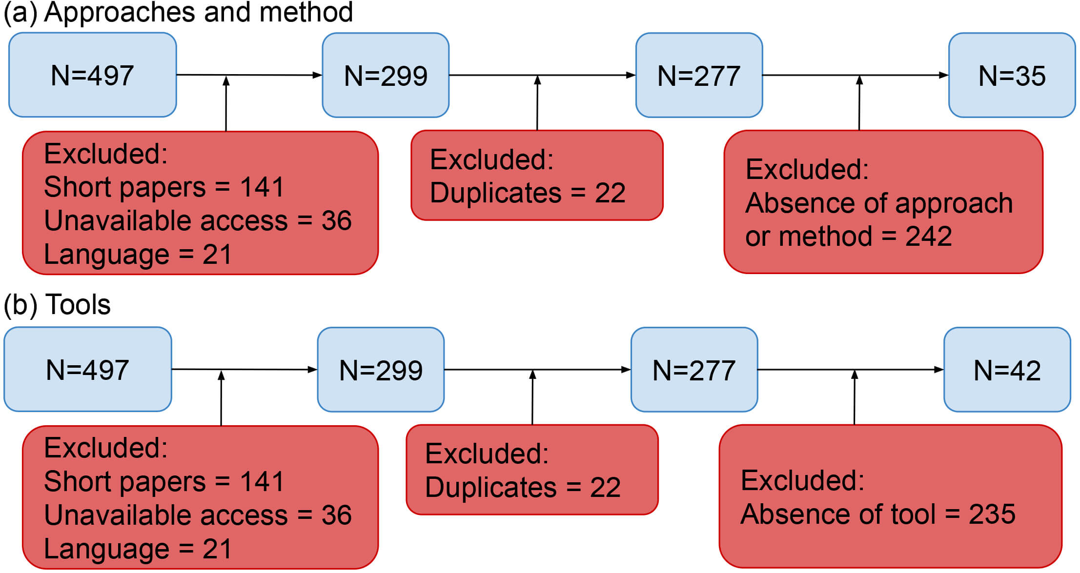 Fig. 1.
Key stages of the systematic literature review for (a) approaches and methods and (b) tools.
To collect qualitative data, the semi-structured interview method was adopted, which combines a script of previously defined questions with the necessary flexibility to explore new themes that emerge throughout the interaction (Lombardi et al., 2021). This approach allowed the interviewer to reorder and adapt questions based on participants’ responses while ensuring both in-depth data collection and comparability across interviews.
Interviews were conducted with students from the Programa de Pós-Graduação em Gestão & Organização do Conhecimento (PPGGOC) and computer science professionals with at least five years of academic or professional experience. The objective was to validate the KG visualization process model developed based on the results of the SLR described above. The interviews were held via videoconference between February 10, 2025 and February 24, 2025, each lasting approximately 30 minutes. The interview script was divided into two sections: (i) questions related to participants’ profiles and (ii) questions focused on analyzing the proposed model. The sample included seven experts and seven postgraduate students who participated in the study.
During the interview, the model was presented in a detailed, step-by-step format. Participants were, then, invited to comment on the following aspects: (i) The understanding of the model: was the methodological process clear? (ii) Questions: Were there any aspects that generated doubts? (iii) Refinement: Which elements could be removed? (iv) Improvement: Which elements should be added? (v) and Additional comments: suggestions or relevant observations.
After each session, a copy of the model was provided to participants to allow for further contributions before the final version was published.
This section presents the results obtained through the methodological procedures outlined in Section 3. Section 4.1 details the selection of Visualization Features (VF), which serve as the foundation of the evaluation framework. Section 4.2 introduces a theory-informed, user-centered process model that translates qualitative insights and KO principles into a structured workflow. Section 4.3 presents the KG visualization tools that met the inclusion criteria and were deemed eligible for comparison. Section 4.4 provides a comparative analysis of these tools in relation to the selected VF. Finally, Section 4.5 discusses the findings, synthesizing the results and examining their broader implications for the field of KG visualization.
By applying the methodological procedures described in the previous section, 35 articles were selected (Fig. 1a), allowing the identification and categorization of different approaches to KG visualization. These approaches reflect recurring strategies in the literature to facilitate navigation, understanding and manipulation of complex structures, such as semantic graphs. The main categories identified are presented below as VF:
(VF1) Node expansion function (Demelo and Sedig, 2021; He et al., 2019; Nečaský and Stenchlák, 2022): allows users to explore the graph interactively by expanding a specific node, revealing only its direct connections to prevent visual overload.
(VF2) Node information display (Demelo and Sedig, 2021; He et al., 2019; Kleebaum et al., 2021; Nečaský and Stenchlák, 2022; Peng et al., 2022; Wiens et al., 2019): when selecting a node, its corresponding information is displayed in complementary areas of the interface, usually with a “Show/Hide” toggle option. This feature helps reduce cognitive load during extensive investigations.
(VF3) Glossary construction and tree diagram (Alter, 2022; Basyuk and Vasyliuk, 2021; Demelo and Sedig, 2021; Kleebaum et al., 2021; Peng et al., 2022; Sheng et al., 2019): this involves the presentation of organized or hierarchically structured lists in a tree format, facilitating the quick location of terms and improving both efficiency and usability.
(VF4) Chronological visualization (Kleebaum et al., 2021): enables tracking of data modifications over time, providing a historical perspective of the changes made and supporting evolutionary analysis of the content.
(VF5) Graph-associated metrics and statistics (Desimoni et al., 2020; Kleebaum et al., 2021; Nečaský and Stenchlák, 2022; Zhu et al., 2019): these offer quantitative information that supports specific insights, such as centrality, degree of connectivity and data distribution patterns.
(VF6) Use of heatmaps/visual backgrounds to assist in cluster identification (Ha et al., 2019; Wiens et al., 2019): these visual aids support the identification of semantic groupings within the network, enhancing the interpretation of structural relationships among concepts.
These preliminary results reveal a diversity of strategies applied in graph visualization and, specifically, a solid basis for the construction of the model proposed in this study. The next section details the methodological process.
The methodological process of visualization presented in this study provides a structured and theory-informed approach to the design, implementation, and evaluation of interactive KG visualization. Grounded in the principles of KO and guided by DSR, the process was developed to translate user needs into functional and methodological requirements (see Section 3). It integrates qualitative insights from user studies with theoretical perspectives on cognition and information behavior, resulting in a process model that operationalizes KO theory within practical tool development.
The primary objective of the proposed model is to provide a structured representation of the workflow underpinning the interactive visualization and exploration of KGs. Beyond serving as a technical sequence of tasks, the model functions as a conceptual bridge that connects identified user needs with the functional design of the visualization artifact. In this capacity, it demonstrates how qualitative findings derived from user engagement, particularly through semi-structured interviews, were systematically translated into a formalized workflow. Its contribution to the research is twofold: (i) it serves as a translation of user needs into functional and methodological requirements, as identified during the semi-structured interviews; and (ii) it operates as a design-science artifact at the conceptual level, establishing the connection between KO theory, particularly user-based and cognitive perspectives, and the practical development of visualization tools. As such, the model provides the methodological foundation for the construction of the visualization tool, guiding both the selection of VF (e.g., incremental exploration, temporal visualization, perceptual aids) and the iterative evaluation of their usability.
The interviews highlighted recurrent challenges that users encounter when interacting with KG visualizations. Interviewees frequently reported frustration with heterogeneous and unaligned data sources, underscoring the need for semantic consistency, reliable provenance, and a reduction in preprocessing burden. In addition, they underscored the importance of intuitive navigation mechanisms, such as contextual filtering and drill-down exploration, while noting the risk of cognitive overload when excessive node expansion occurred. Closely related to this, participants emphasized the necessity of flexible visual layouts that balance overview and detail, alongside strategies for reducing visual clutter, given that representational clarity directly affects interpretability and sense-making. In this regard, respondents highlighted the value of maintaining clear distinctions between local and global perspectives within the visualization environment.
Several participants also expressed concerns regarding the potential for wasted effort, stressing the relevance of feasibility checks and the need for visualization VF that facilitate the recognition of patterns, clusters, and anomalies. Moreover, the interviews revealed a recurrent reliance on expert interpretation, particularly when users encountered difficulties or felt “stuck” during the analysis process. This indicates that support structures enabling expert intervention are perceived as essential for advancing the interpretive stages of visualization. Finally, participants emphasized the systematic documentation of insights to ensure traceability, reproducibility, and reuse. Such practices were regarded as fundamental to the effective transfer of knowledge both within organizational contexts and across broader scientific communities.
The process model illustrated in Fig. 2 delineates a comprehensive and structured workflow for the interactive visualization and exploration of KGs. It begins at the Start node, where initial visualization requirements are identified and articulated, and subsequently unfolds through thirteen interconnected phases. Together, these phases operationalize the translation of user needs into methodological and functional requirements, ensuring that visualization fulfills both analytical and communicative purposes. (i) (Re)Define Visualization Objectives. This stage constitutes the formal entry point of the process, functioning as an anchor that guarantees the subsequent activities remain explicitly aligned with clearly articulated objectives. The prefix “(Re)” underscores the iterative and adaptive nature of this phase: objectives are regarded not as static endpoints, but as evolving constructs subject to refinement in response to emergent insights, stakeholder feedback, or changing contextual conditions. This recursive design fosters a continuous alignment between evolving goals and the methods employed, thereby promoting methodological rigor while preserving adaptability. (ii) Data Acquisition and Preparation. At this stage, both structured and unstructured data are collected, integrated, and preprocessed to construct or enrich the KG. This involves addressing heterogeneity, ensuring semantic consistency, and verifying data integrity. Effective data wrangling at this point is critical for securing alignment with the visualization objectives and for enabling meaningful downstream analysis.
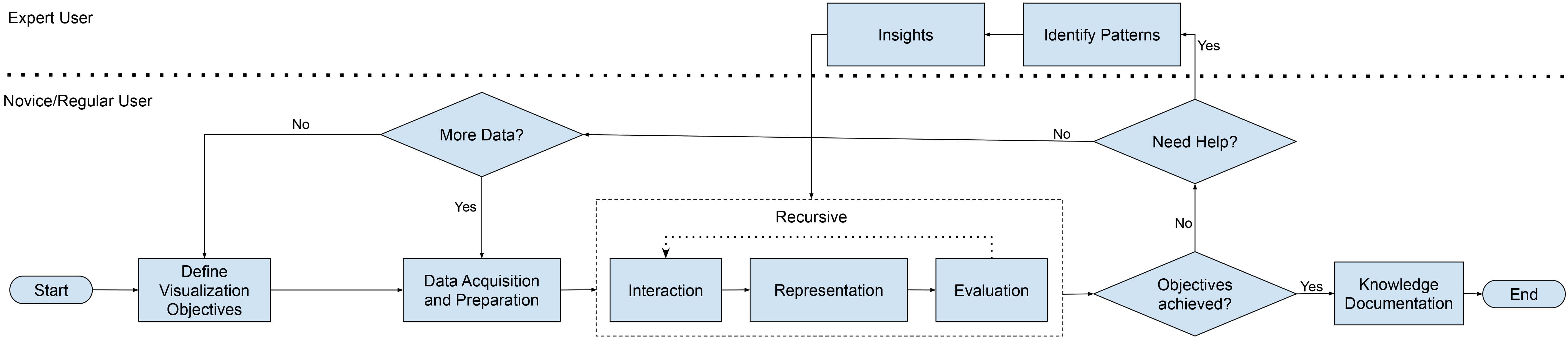 Fig. 2.
Methodological process. Presents the proposed model, consolidated after incorporating the participants’ suggestions.
The following phases highlight the dynamic and iterative interaction between users and the visualization artifact: (iii) Interaction. Users engage in exploratory analysis through operations such as dynamic navigation, filtering, and query-based exploration. These interactions enable direct interrogation of the KG’s structure and content, thereby supporting flexible and user-driven analytical trajectories. (iv) Representation. The KG is rendered through appropriate visualization techniques (e.g., node-link diagrams, hierarchical layouts, semantic zooming). The representational approach directly shapes the interpretability of the KG, influencing the ease with which users can discern structures, identify relationships, and generate insights. (v) Evaluation. The generated visualizations are critically assessed in terms of usability, cognitive load, semantic clarity, and fidelity to the defined objectives. Evaluation integrates user-centered methods with system-level performance metrics, thereby providing a holistic account of cognitive adequacy and technical robustness.
Beyond these interactive stages, expert engagement assumes a pivotal role in enabling deeper analytical outcomes: (vi) Insights/(vii) Identify Patterns. Effective visualization facilitates the discovery of meaningful insights and the identification of latent patterns, correlations, or anomalies within the KG. Expert users are often essential in interpreting complex findings, contextualizing them, and guiding further refinement of visualization strategies.
In order to maintain methodological rigor and adaptability, the model incorporates several decision points that regulate iteration and feedback loops: (viii) Objectives Achieved? This phase assesses whether the original goals have been successfully met. If not, the process typically loops back to earlier stages, such as data preparation or interaction, to enable refinement. (ix) Need Help? Evaluates whether expert consultation, tool-based support, or domain-specific guidance is required to overcome interpretive or technical barriers. (x) More Data? Determines whether additional data are necessary to enhance representational adequacy or to achieve the defined objectives. If so, the process reverts to data acquisition. (xi) Review Context Scope. Examines the feasibility of objectives in light of available resources, tools, and contextual constraints. When objectives prove unviable, they are reformulated or adjusted to ensure coherence with real-world conditions. (xii) Exceeded Interactions? Evaluates whether user-system interactions have surpassed interpretable or manageable thresholds. If excessive interaction complexity is detected, the process loops back to objective redefinition in order to mitigate risks of cognitive overload and analytical inefficiency. (xiii) Knowledge Documentation. Once the objectives are achieved, the resulting insights are systematically documented. Documentation secures reproducibility and transferability, while also facilitating integration into organizational knowledge bases or scientific repositories.
The process concludes only when knowledge has been effectively extracted, validated, and recorded. In this way, the model is not merely a technical pipeline but a conceptual framework that operationalizes user-informed, iterative, and theoretically grounded visualization practices within the broader scope of Knowledge Organization.
The model does not merely depict a technical pipeline. Instead, it embodies the translation of user needs into functional requirements, ensuring that each stage corresponds to an identified usability or cognitive demand. This clarifies that the model should not be interpreted as a purely technical artifact or as a software architecture. Rather, it represents a user-informed, conceptually grounded framework for KG visualization, deeply embedded in KO principles and design to balance methodological rigor with practical usability.
Among the 497 retrieved studies, 42 focused on KG visualization tools (Fig. 1b). The screening was based on the availability of valid links for direct access to the tools or repositories and their respective source codes, ensuring their availability for analysis.
In the initial assessment, 36 tools were identified. However, 13 were associated with inactive links or discontinued projects, 10 lacked ongoing maintenance or user support, and 5 were available only as code packages without functioning as standalone visualization tools.
After applying the inclusion criteria, eight tools were retained for in-depth analysis. In addition to these, we developed Deigmata, a user-centered KG visualization tool. We provide a brief introduction to each of these tools.
(i) Clean Analyze Network Visualization Software (CANVS) (https://sourceforge.net/projects/canvs/) is an interactive application that streamlines the analysis of mass spectrometry-derived protein-protein interactions (PPIs) and associations (PPAs). It provides an accessible pipeline to clean, analyze, and visualize complex datasets, enabling the creation of PPI/PPA networks. Main features include integration with specialized databases for biological contextualization and a Gene Ontology (GO) module that identifies relevant GO terms and generates functional protein networks. Designed for usability, CANVS supports researchers lacking established bioinformatic pipelines by combining simplicity with advanced visualization and analytical capabilities (Velasquez et al., 2021).
(ii) CompositeView (https://github.com/pathology-dynamics/composite_view) is an open-source application for interactive visualization of large and complex networks. It introduces composite scores to aggregate conceptually similar data, reducing information overload. The system dynamically recalculation scores during filtering and aggregation, and offers customization via node/edge filters and layout controls. Demonstrated across biomedical, socioeconomic, and clinical datasets, CompositeView outperforms conventional tools in enabling scalable, user-driven exploration (Allegri et al., 2022).
(iii) Dive into the Venn diagram (DiVenn) (https://divenn.tch.harvard.edu/v2/) is a web-based tool for comparing gene lists from multiple RNA-Seq experiments through an interactive force-directed graph. It integrates pathways and GO annotations, enabling users to explore gene regulation patterns across overlapping datasets. Key features include: visualization of gene expression levels in comparative networks; interactive filtering and highlighting of genes by pathway or GO terms; built-in pathway and GO enrichment analysis; and export of high-resolution images and gene-associated information (Sun et al., 2019).
(iv) Knowledge Graph Exploration and Visualization (KGEV) (https://github.com/WGLab/kgev-neo4j) is a web-based framework for the construction, exploration, and visualization of KGs. It supports a five-stage pipeline: triple extraction, filtration, metadata preparation, knowledge integration, and graph database preparation. The system offers interactive tools for node/edge search and filtering, neighborhood retrieval, shortest path calculation, and data source filtering, enabling efficient KG navigation. Main features are the ability to retrieve supporting texts for extracted relationships, enhancing validation and reliability assessment (Peng et al., 2022).
(v) Graph visualization Meta Ontology (GizMO) (https://gizmo-vis.github.io/gizmo/) is a graph visualization meta-ontology designed to enable customizable visual representations of ontologies. Built on Web Ontology Language (OWL) annotation mechanisms, its methodology separates visualization into two layers: graphical representation of OWL constructs and visual properties of conceptual ontology elements. Through annotation ontologies and a modular architecture, GizMO ensures a clear separation between ontological content and its visualization. It defines five annotation object types (e.g., spatial position, zoom factor, background color) to support flexible node-link diagram representations. Demonstrated across multiple applications, GizMO highlights the adaptability of ontology visualization to diverse user needs and contexts (Wiens et al., 2019).
(vi) Knowledge Graph Browser (KGBrowser) (https://github.com/linkedpipes/knowledge-graph-browser-website) is an experimental tool for knowledge graph visual exploration that employs shareable and reusable visual configurations to facilitate accessibility for non-expert users. These configurations define domain-specific views and intuitive operations, such as node detail inspection and graph expansion, while concealing unnecessary complexity. An ontology is introduced to formally express and publish visual configurations, enabling reuse across different contexts. KGBrowser was evaluated with real users and benchmarked against existing visualization tools, demonstrating its potential to simplify graph exploration and integration across heterogeneous data sources (Nečaský and Stenchlák, 2022).
(vii) Monash Gene Ontology (MonaGO) (https://github.com/liyuanfang/MonaGO) is a web-based visualization system designed to enhance the interpretation of GO enrichment analyses. It provides an interactive and responsive interface that supports both gene lists and GO terms as inputs. The platform integrates dynamic clustering, customizable visualizations, and single-page interactive outputs, enabling users to explore enriched GO terms intuitively. Results can be exported as high-resolution images or restored in new sessions, ensuring reproducibility (Xin et al., 2022).
(viii) OntoTrek (https://github.com/cidgoh/ontotrek) is a 3D ontology visualization tool that facilitates the exploration of interconnected ontologies by leveraging human stereoscopic perception and spatial navigation. Unlike traditional textual or 2D diagrammatic representations, OntoTrek provides an interactive three-dimensional environment that highlights imported terms and their domains, offering both foreground focus and background context for ontology structures. This approach enhances the ability of diverse stakeholders; including students, developers, curators, and funders; to recognize the reuse of community-supported ontology resources and better understand the interwoven nature of knowledge representation (Dooley et al., 2023).
(ix) Deigmata (https://github.com/rafaro/deigmata) is a user-centered KG visualization tool designed to address ergonomic and usability challenges in exploratory analysis. We developed through a DSR approach informed by a SLR and semi-structured interviews (see Section 3), Deigmata emphasizes cognitive ergonomics and collaborative interaction. The tool supports multiple user roles, integrating process triggers that lower barriers to exploration for non-expert users. By aligning visualization design with user needs, the tool facilitates more accessible, interactive, and meaningful KG exploration, extending beyond algorithmic or tool-centric approaches commonly found in the literature.
Finally, the subsequent section presents a comparative analysis of the selected tools, offering a systematic examination of their VF.
To assess the capabilities of current KG visualization tools, we conducted a comparative analysis based on a set of nine VF identified as relevant to user-centered, exploratory and interactive graph-based systems. These features reflect both functional and non-functional aspects that contribute to usability, interpretability and applicability across diverse scenarios.
The six core features (VF1–VF6), which focus on interaction and cognitive support mechanisms, were discussed in the section before. In addition to these, we introduce three complementary features related to the openness, maturity and flexibility of the tools: (VF7) Open Source, which indicates whether the tool is available under an open-source license, facilitating transparency, community collaboration and extensibility. (VF8) Production-Ready, which assesses whether the tool is stable and mature enough for deployment in real-world projects, often supported by documentation, updates or community usage. (VF9) Agnostic Architecture, which refers to the tool’s ability to operate independently of specific data formats, ontologies or domains, thus supporting broader applicability across contexts.
Each tool was systematically analyzed for the presence or absence of these features, and, where applicable, for the quality of their implementation. This comparative assessment makes it possible to identify strengths, gaps and potential areas for improvement in existing KG visualization solutions. Table 2 presents a detailed evaluation of nine selected tools, highlighting their alignment with the proposed VF. Moreover, the table includes the total number of features supported by each tool and corresponding percentage coverege (Cover. (%)) of features.
| CANVS | Composite view | DiVenn | KGEV | GizMO | KGBrowser | MonaGO | OntoTrek | Deigmata | |
| VF1 | 0 | 0 | 0 | 0 | 1 | 1 | 0 | 0 | 1 |
| VF2 | 1 | 1 | 1 | 1 | 1 | 1 | 1 | 1 | 1 |
| VF3 | 1 | 1 | 1 | 1 | 0 | 1 | 1 | 1 | 1 |
| VF4 | 0 | 0 | 0 | 0 | 0 | 0 | 0 | 0 | 1 |
| VF5 | 1 | 0 | 1 | 0 | 0 | 0 | 1 | 1 | 1 |
| VF6 | 0 | 0 | 0 | 0 | 0 | 0 | 1 | 0 | 1 |
| VF7 | 1 | 1 | 0 | 1 | 1 | 1 | 1 | 1 | 1 |
| VF8 | 1 | 1 | 1 | 1 | 1 | 1 | 1 | 1 | 0 |
| VF9 | 0 | 1 | 0 | 0 | 1 | 1 | 0 | 0 | 1 |
| Total | 5 | 5 | 4 | 4 | 5 | 6 | 6 | 5 | 8 |
| Cover. (%) | 55.56 | 55.56 | 44.44 | 44.44 | 55.56 | 66.67 | 66.67 | 55.56 | 88.89 |
KGEV, Knowledge Graph Exploration and Visualization; CANVS, Clean Analyze Network Visualization Software; DiVenn, Dive into the Venn diagram; GizMO, Graph visualization Meta Ontology; MonaGO, Monash Gene Ontology; KGBrowser, Knowledge Graph Browser; VF, Visualization Features; Cover., Coverage; VF1, Node expansion function; VF2, Node information display; VF3, Glossary construction and tree diagram; VF4, Chronological visualization; VF5, Graph-associated metrics and statistics; VF6, Use of heatmaps/visual backgrounds; VF7, Open Source; VF8, Production; VF9, Agnostic Architecture; 0, absence of VF; 1, presence of VF.
The comparative analysis of KG visualization tools based on the nine proposed Visualization Features (VF1–VF9) offers not only their current technical capabilities but also broader implications for KO. From a KO perspective, these features underscore the role of visualization as a mediating layer between complex semantic structures and user cognition, thereby shaping both the design of Knowledge Organization Systems (KOS) and the practices of conceptual modeling. In line with the historical development of user-based methodologies in KO, such as the incorporation of psychological approaches into information retrieval research (Hjørland, 2014), the findings indicate that contemporary visualization tools unevenly integrate functionalities that effectively support cognitive processes and exploratory interaction.
A central observation is the limited adoption of advanced interaction features that support cognitive offloading during exploratory tasks. For example, VF1 (Node Expansion Function), a key feature for managing visual complexity through incremental exploration, is implemented in only three tools: GizMO, KGBrowser and Deigmata. This suggests that while many tools aim to present comprehensive views of graph structures, few adequately support progressive disclosure strategies, which are essential for scalability and usability in large graphs.
VF2 (Node Information Display), on the other hand, is widely adopted across all tools, reflecting a common understanding of the need to separate structural navigation from content exploration. This consistent implementation supports deeper inspection of nodes without overwhelming the primary view, aligning well with best practices in interactive visualization.
A more specialized feature, VF4 (Chronological Visualization), appears solely in Deigmata, highlighting a critical gap in temporal affordances across most tools. This lack of temporal exploration capabilities limits the analysis of data evolution, a growing requirement in dynamic domains such as knowledge management, research tracking and historical data integration.
The inclusion of VF3 (Glossary Construction/Tree Diagrams) in nearly all tools (except GizMO) indicates an emphasis on structured navigation. However, the absence of this feature in GizMO suggests that some tools prioritize free-form exploration over taxonomically guided discovery, which may affect usability for non-expert users.
In terms of visual aids for pattern recognition, only MonaGO and Deigmata support VF6 (Use of Heatmaps/Visual Backgrounds). This limited adoption suggests a potential underutilization of perceptual techniques that could significantly improve the identification of semantic clusters or communities within the graph.
Regarding non-functional features, VF7 (Open Source) and VF8 (Production-Ready) demonstrate how tools differ in their maturity and openness. All tools are open source, except for DiVenn, while all are considered production-ready, except for Deigmata, which remains under development. These aspects are crucial for adoption in professional environments, where support, maintenance and transparency are often deciding factors.
Finally, VF9 (Agnostic Architecture), indicating flexibility in handling diverse data formats and ontologies, is present in CompositeView, GizMO, KGBrowser and Deigmata. This feature becomes increasingly relevant as organizations seek to integrate heterogeneous data sources without being constrained by tool-specific formats.
In summary, while most tools provide core functionalities, such as node information display and structural navigation, there is clear potential to improve user-centered design through advanced interaction (e.g., node expansion and temporal views) and perceptual support (e.g., heatmaps). Deigmata stands out by incorporating underrepresented features like VF4 (Chronological Visualization) and VF6 (Heatmaps), though its development stage limits immediate deployment.
Taken together, these findings suggest that KG visualization tools currently consolidate basic functionalities (structural navigation, node inspection) but underexploit opportunities for supporting cognitive and sociocultural dimensions of KO. Deigmata is distinctive in this regard: its inclusion of VF4 and VF6, designed through a user-informed and methodologically grounded process (semi-structured interviews), aligns with calls to integrate psychological insights with domain-analytic knowledge, thereby bridging the tension between user-based elicitation and domain-specific authority. Nevertheless, its developmental status limits its immediate applicability in production environments.
From the perspective of the DSR methodology, the current stage of this research corresponds to the following activities: DPE (iv), Demonstration, DPE (v) Evaluation and DPE (vi) Communication, wherein the artifact is being applied to use cases, assessed against defined objectives, and its contributions, disseminated to the broader academic and practitioner communities. The results underscore the importance of situating visualization not only as a technical layer for accessing KOS, but as an epistemological intervention shaped by the interplay of cognitive, cultural and domain-analytic perspectives. Future innovation in KG visualization should therefore aim to balance usability, expressiveness and scalability while remaining attentive to the broader theoretical debates in KO regarding the nature of concepts, user cognition and cultural relativism.
This study examined the role of KGs in advancing KO and KR within the broader framework of KOS. While KGs are increasingly adopted for managing complex, interconnected data, their visualization remains under-theorized in KO. Our analysis demonstrates that existing visualization tools tend to prioritize algorithmic sophistication and structural rendering, with comparatively little attention to user-centered design, cognitive ergonomics, or epistemological considerations. This imbalance underscores the need to reposition visualization not merely as a technical artifact, but as a theoretical and methodological instrument that shapes how knowledge is elicited, modeled, and socially contextualized.
Building on insights from user-based methods, critiques of the cognitive paradigm, and debates over conceptual universality versus cultural relativity, this study argues that visualization practices are deeply entangled with KO theory. Far from being neutral displays, visualization choices mediate how users engage with knowledge structures, negotiate meaning, and perceive conceptual boundaries. By adopting a DSR methodology, integrating a systematic literature review and semi-structured interviews, we identified nine core VF that extend the design space of KOS. These features articulate design principles that support incremental exploration, contextual interpretation, temporal reasoning, and perceptual pattern recognition. In this way, visualization is positioned as a site of theoretical convergence, linking user studies, conceptual modeling, and KOS design in a unified research agenda.
The development of Deigmata illustrates these principles in practice. By integrating underrepresented features such as chronological visualization and perceptual clustering, the prototype demonstrates how user-informed design can simultaneously advance KO theory and practice. Preliminary evaluations indicate that Deigmata not only responds to concrete user needs but also operationalizes KO principles of usability, semantic expressiveness, and contextual meaning-making. In doing so, it contributes to a more nuanced understanding of how visualization functions as both an epistemic and ergonomic instrument in KO.
Nevertheless, important limitations must be acknowledged. The evaluation relied on interviews with 14 participants, a relatively small and homogeneous sample. While suitable for an initial DSR demonstration, future studies should involve larger and more diverse user groups across domains to strengthen the validity and transferability of findings. Moreover, Deigmata remains a prototype and is not yet production-ready. This status has dual implications: on the one hand, it limits immediate practical deployment; on the other, it highlights the value of prototyping as a research method for testing theoretical constructs and design principles before large-scale implementation. For practitioners, this emphasizes the importance of iterative design and incremental adoption; for researchers, it signals an opportunity to refine the methodological integration of visualization, KO theory, and user-centered inquiry.
In conclusion, KG visualization should be understood not only as a technical challenge but as a theoretical and practical frontier for KO. It offers a fertile ground for advancing discussions on conceptual modeling, domain analysis, and user interaction, while also bridging KO with information visualization and human-computer interaction. By situating visualization at this intersection, this study contributes to repositioning KOS design as both a technical practice and a KO-theoretical intervention—one that illuminates how knowledge is constructed, organized, and made accessible in socio-cognitive and cultural contexts.
The datasets used and analyzed during the current study are available from the corresponding author on reasonable request.
RR and GÂL designed the research study. RR analyzed the data. RR wrote the original draft. Both authors contributed to editorial changes in the manuscript. Both authors read and approved the final manuscript. Both authors have participated sufficiently in the work and agreed to be accountable for all aspects of the work.
The second author acknowledges the support of the Brazilian National Council for Scientific and Technological Development (CNPq/Brazil) through the Research Productivity Grant (PQ-B, Grant No. 313645/2020-5).
This research received no external funding.
The authors declare no conflict of interest.
During the preparation of this work the authors used ChatGPT-4 in order to check spell and grammar. After using this tool, the authors reviewed and edited the content as needed and take full responsibility for the content of the publication.
References
Publisher’s Note: IMR Press stays neutral with regard to jurisdictional claims in published maps and institutional affiliations.